Projects
Introducing the Briar Android Illustration System
Ergi Shkëlzeni
3 min lesen
Ura has been working with Briar since 2018, namely on various UX features such as adding contacts remotely, SD card message sync, image attachments, mailbox features and more.
As we have worked on various short engagements throughout the years which required certain educational or illustrative images, the image coherency of icons and illustrations deteriorated as Briar received more and more features and visual assets became an afterthought.
This resulted in over 30 illustrations looking vastly different from each other and desperately in need for unification. Beyond that, the current illustrations were not optimized for both dark theme and light theme creating some accessibility problems as well.
As part of the Open Tech Fund Secure Usability and Accessibility Lab, we supported Briar with an illustration audit, redesigning a set of illustrations and iconography assets and documenting them for future usage across different platforms.
Process
We started by exploring several visual style directions for Briar’s Illustration System, basing the creative process on Briar’s brand identity and communicating with the project leads to better understand the needs and determine the best direction. After refreshing the UI color system, we proposed two main directions for the style of the illustrations, all scalable, having the possibility to create a consistent illustration system out of them.


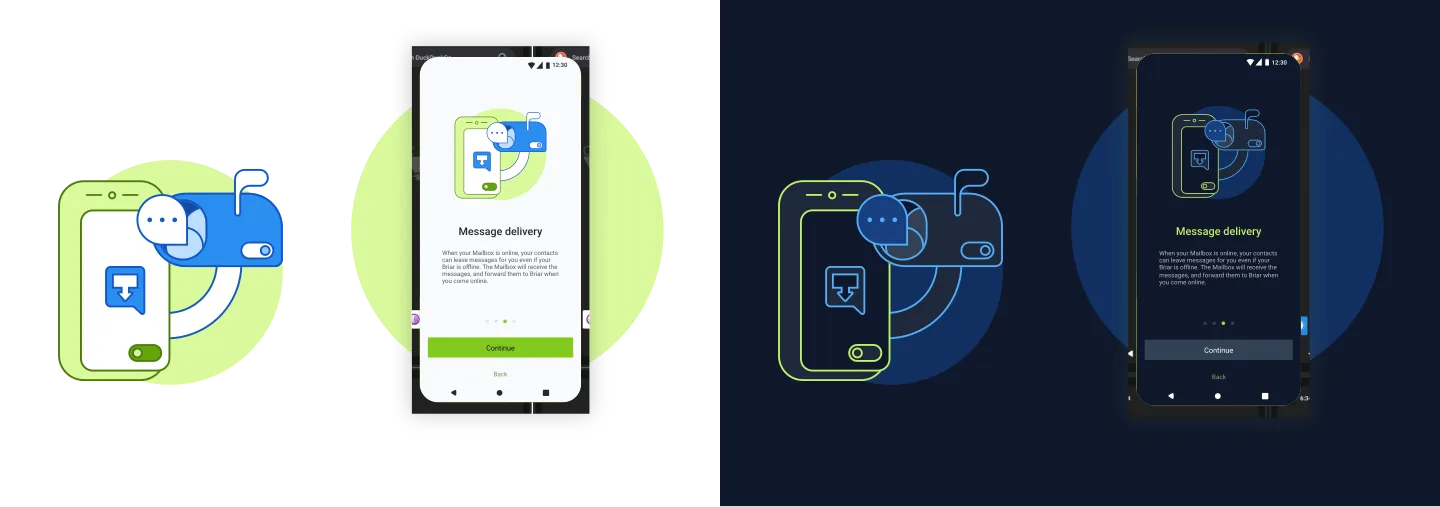
After presenting the visual styles and receiving feedback from the Briar team, we decided to keep elements from both and work on a new direction to replace the current Briar’s App illustrations. We recreated five of the current images for the third visual style using the updated color system and visual style.


Illustration System
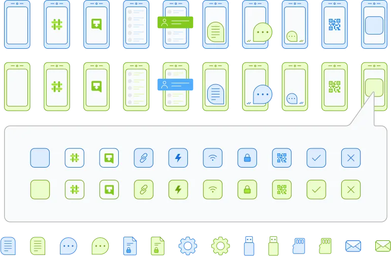
After deciding on the visual direction, we built an Open source variant-based illustration system with over 368 unique elements, including variants for dark mode and light mode, offering a variety of possible combinations. This way, new illustrations can be created just by dragging & dropping elements and playing with their variants on Figma while preserving the visual consistency.
We are working to release these illustrations licensed under a Creative Commons license on Figma community as well.


An illustrious future
We have been working with Briar for over 4 years now. During this time we constantly added new features and designed new experiences. Over time a bit of design debt has been collected, mostly noticeable in the different style and incoherent usage of illustrations, iconography and UI elements. With this we are doing the first step of creating a system for illustrations coherent across the app as well as having the needed ingredients for new illustrations when new features are added in the future We hope that this will be the first step in refreshing Briar’s GUI and with more tweaks coming along in the future.
You can find the source files of the new Briar illustration system on our GitHub repos and Figma Community.