Oxidize - The Conference of embedded Rust
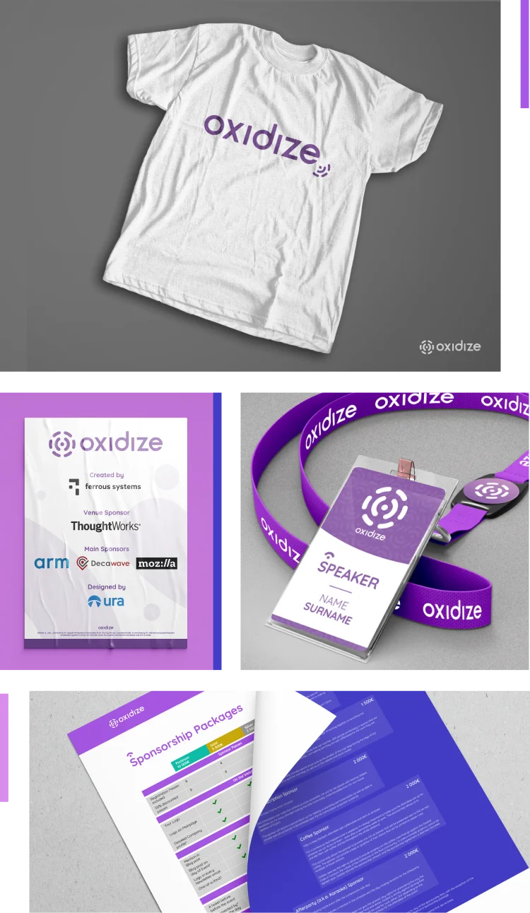
We created the brand and visual identity for Oxidize, designing every digital and print asset for the conference and providing a long-term design solution.
Services
Links
Oxidize is the conference for people interested in embedded Rust. Run by Ferrous Systems GmbH, a consultancy for network programming and embedded systems in Rust, it’s the best place for people interested in hardware and IoT to meet.
They needed a visual brand to be in alignment with what they communicate and to visually represent them. The visual identity design for Oxidize consisted in creating a clean, aesthetic, modern look for the conference and its community.
Playing with the symbols
Combining the concept of circuits and chemistry helped me design this logo. It is simple, monochrome, and symbolically based on the atomic structure of Oxygen and the role of embedded systems in technology. The open spaces between the rounded shapes represent the open-source.


Words to graphics
The identity of Oxidize Conference comes with characteristics as:
• State of the art
• Open
• New
• Stable


Wordmark in binary
The Oxidize logo wordmark is inspired from the binary system which is made from “0” and “1”. Using a simple minimal design for the “i” and the “o”, applying the same style on the other letters, we designed a unique wordmark for Oxidize, which is modern and stable.


Consistency
After setting the visual identity, everything else was done step-by-step. With variations of the logo shapes and the primary colors of the brand, the print deliverables were designed, including T-shirts, Badges, Posters, Stickers, etc.

How we helped
- We helped Oxidize create their brand and vizual identity.
- We offered consistent design of every print and digital asset.
- We redesigned their webside, improving it visualy based on the brand identity and providing a better user experience.