Projects
HTTPS Everywhere Redesign
Renata Gegaj
3 min read
HTTPS Everywhere is a free and open-source browser extension for Google Chrome, Mozilla Firefox, Opera, Brave, and Firefox for Android, which is developed collaboratively by The Tor Project and the Electronic Frontier Foundation (EFF).
It automatically makes websites use a more secure HTTPS connection instead of HTTP if they support it. HTTPS Everywhere makes it possible to block and unblock all non-HTTPS browser connections with one click.
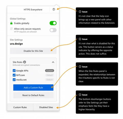
In an effort to improve the user experience, we worked with the EFF team to reimagine HTTPS Everywhere. From our initial user research, we identified issues related to information hierarchy, interface copy, and usability.
Challenges
Considering the fact that security-focused software often targets tech-savvy people, it tends to be intimidating for “average” users. Although HTTPS Everywhere is a security tool, its purpose is to ensure a secure connection and protect all; therefore, it targets a wide range of users.
Our challenge here was balancing out a simple interface with complex features. We needed to find a way to keep the design understandable for “the average user,” yet intuitive for the “advanced user.” We decided to channel all our efforts into making the extension inclusive to all people despite their computer expertise, professional background or disabilities.
Research
Throughout the redesign process, we used UX research as an instrument to get closer to users. We decided to start with qualitative research, to then continue on with a quantitative approach. We conducted a few iterations of usability tests and also ran accessibility audits to make sure the whole user experience ties in smoothly.
The research phase helped us tremendously in getting to know the users and tracking down all the pain points they’ve encountered while using HTTPS Everywhere. It also helped us get a feel for the overall experience users had when using the extension. Developing personas during this phase helped shape the design while keeping in mind our target users, which we had available to refer back to whenever we needed.
Survey
The survey questions were mostly focused on web security. We wanted to know more about participants’ general understanding of security on the web and how the HTTPS Everywhere extension fits into it. The survey included 12 questions, a mix of open and closed questions. We shared it on a few different platforms to target a diverse range of users, 34 people in total filled out the survey.
Usability Testing
We conducted 1:1 traditional Usability Testing sessions. Participants were equipped with laptops and papers with the tasks that they needed to perform during the test. On traditional usability testing, typically only one participant at a time can enter the room and take the test. The test administrator was sitting next to the participant observing and taking notes. The session captured each participant’s navigational choices, task completion rates, comments, overall satisfaction ratings, questions, and feedback. We conducted 5 testing sessions per iteration.
Shaping the design
After completing the research phase, we started shaping the design. We decided to take an iterative approach. First, we did tentative design mockups and then tested them with participants’ matching profiles with users extracted from persona development.
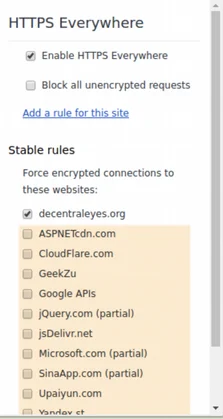
Original

Iteration

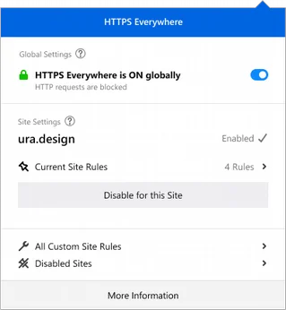
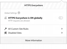
Iteration 2 & 3


Conclusion
Designing for a browser extension is quite challenging considering the limited space they offer but we managed to use the space wisely while being mindful to not overcrowd it. You can view our HTTPS Everywhere case study and all source files on our portfolio page.