Projects
LibreOffice Conference 2018
Elio Qoshi
3 min read
As part of dedicating our efforts to improve local grassroot initatives, we were delighted to be curating the visual identity of the LibreOffice Conference (short LibOCon). The conference is organized by the local Open Labs Hackerspace community, with which we share a lot of values and goals together.
We were particularly excited to support this year’s edition as it would be the first time the local community would host a major Free Software project conference in Tirana, Albania. We hope to see more happening outside the usual western spots like Berlin, London and welcome more projects to contribute locally. With LibreOffice being the most used alternative to proprietary Office software, we were eager to chime in and help out. With more than 130 contributors coming together for 4 days, Tirana became the focus point of everything LibreOffice and Document Freedom related, even the Mayor of Tirana attended. Further, LibOCon was also a great opportunity to invite friends at the Open Source Design Summit in November, held at the same Venue (Ofiçina).
Creative Process
To create a visual identity for LibOCon 2018, we had to consider two main elements: the clock tower, a local element from Tirana, and an element of LibreOffice brand. The most difficult and interesting part of the whole creative process was finding a balance between those two elements.
Let’s start it with the logo. For this year conference, we sketched a monoline icon of the clock tower of the city, inside a hexagonal frame as the logo. The clock tower is one of the most popular and most recognizable symbols of Tirana. It is a part of old buildings ensemble of the city center, and it belongs to the city since the beginning of the 19th century.
![]()
For the logotype, we used Zilla Slab [bold] al la Aaron Draplin style. We also picked the LibreOffice green and composed it with black and white, to keep the connection with the umbrella brand clear. The [template for the] logo is also easily adapted to next conferences: we can change the city, the year below and replace Tirana clock tower with a certain symbol from the host city.
Stamps are always closely connected with a certain place and manifest a big event for that place. The idea of the stamp tower came after a brainstorm “how to make an event big”. We see the LibOCon with the importance of a big event not only for the LibreOffice community but even for the city of Tirana. We are working at the local level to make LibreOffice accessible and useful for everyone who works in the public sector. LibOCon 2018 is a big opportunity to show off the benefits of LibreOffice to the actors we are working with.
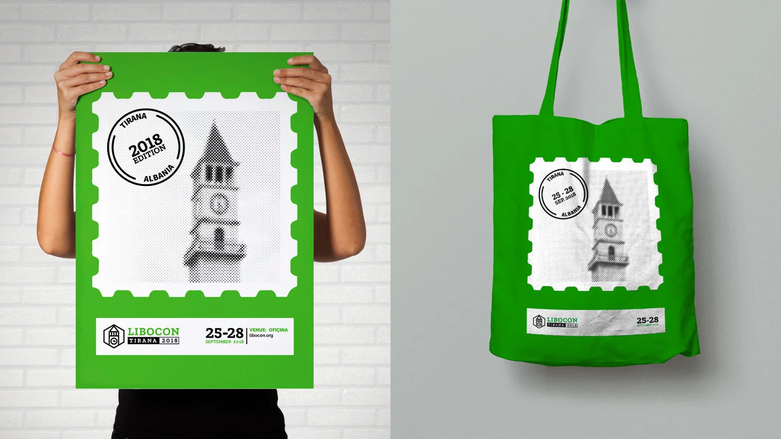
The dates and the venue of the conference are composed in a seal, as they stay for real in postcards. The stamp with the clock tower, the seal of the venue and posters vintage texture make the participants feel like they’re a postcard, as a souvenir from Tirana. The green color of the brand guidelines makes the poster easily identifiable for the community.
Onwards
As always, you are free to explore and remix the designs of our work. In fact, due to us having a great amount of freedom on this particular project, all LibOCon 2018 designs are licensed under a CC0 license (Public Domain dedication). We hope this will foster more innovative design processes for Free Software and Open Source events.
We look forward to the next year’s LibreOffice Conference in Almería, Spain!