Internews’ ADAPT
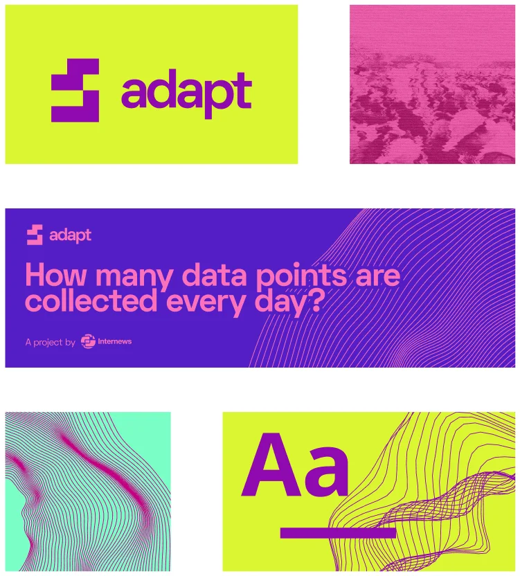
We designed the full visual identity for Internews’ ADAPT, creating a style to graphically represent ADAPT everywhere.
Services
The Advocating for Data Accountability, Protection, and Transparency (ADAPT) Project brings together a consortium of partner organizations in Latin America and Africa to collaborate across countries and regions towards the promotion of rights-respecting privacy policies, and the development of best practices around implementation and enforcement.
The visual identity design for ADAPT consisted in creating a modern and vivid look for the program and it’s community. We created the entire brand design, implementing the style in each deliverable, providing a guideline manual to ensure that the identity of ADAPT is displayed correctly in their future activity.

“Adapting” the logo
The first step was the logo. It needed to be a symbol that could identify Internews’ ADAPT and easily adapt with any graphic style we would develop in the next steps.
The logo aims to be minimal, monochrome, and flexible.
The glyph is made of rectangular shapes, which metaphorically are willing to adapt depending on the circumstances, filling the empty spaces.

Generative art
The abstract supportive graphics of ADAPT’s visual identity are created using Tinkersynth, an experimental art project that lets users create generative art.
With the right color palette, each graphic visualizes one tagline ADAPT wants to express. Graphics with organic curves add life and vibration and the more geometrical ones give the right amount of sharpness to the messages.

Too many colors?
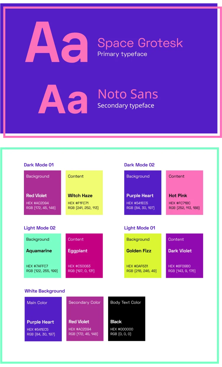
While experimenting with the colors and providing different options, we decided to offer a variety of color combinations and move away from a single color palette representing the brand.
Playing with the contrast and the tones, we provided two palettes for the dark mode and two for the light mode. The fifth one is a mixed palette to be used only on white background as the primary color palette for Internews’ ADAPT.

Brand Book
As an always-evolving project, we put great emphasis on the brand book for ADAPT. With such a diverse and modular colour system, it was important to provide appropriate guardrails for anyone interacting with the brand elements.
Link: Internews’ Adapt - Brand Book

Oftentimes when working on branding projects, it is necessary to think ahead, so the brand can easily scale and adjust once the brand family expands.
This was the case with “Privacy is Global”, the podcast series produced by Internews’ ADAPT, where in addition to creating a sub-brand and the visual design work, we helped with the actual production of the podcast as well.
Link: Privacy is Global - Podcast Series
How we helped
- We helped Internews’ ADAPT create their brand and visual identity.
- We made sure the program was visually presented and engage with their audience in the right way.
- We offered consistent design solutions of every digital asset of the program.
- We helped in the realization of the ADAPT’s podcast series “Privacy is Global” providing audio branding and audio editing in the post-production of 9 episodes.
- We helped ADAPT with their online presence designing their website.