Rallly - Rebranding & User Research
We redesigned Rallly’s identity, delivering a fresh look and offered strategic UX recommendations for an improved user experience.
Rallly is an open-source online scheduling application designed to streamline the coordination and organization of meetings and events. Rallly allows users to create events, invite participants, and determine the most convenient time for everyone through a voting system. Think of it as an open-source alternative to Doodle. Rallly supports asynchronous scheduling, allowing for flexibility in coordinating gatherings without the need for participants to be online simultaneously. The platform’s open-source nature invites user contributions and customization options, making it adaptable to a variety of user needs and preferences.
After a discovery session with stakeholders, we were tasked with both rebranding the platform—renaming it and creating a new visual identity—and conducting comprehensive user research.
Our focus was a threefold objective: rebranding the product, introducing a fresh visual identity, and to deliver valuable insights for potential improvements through in-depth user research and analysis.
- Rebranding Exploration
- Explore alternative names to address challenges with the existing triple “l” nomenclature, and ensure users are able to discover the application easily.
- Visual Identity Design
- Enhance the visual identity with a focus on readability and color contrast for improved accessibility.
- User Research
- Learn about user interactions with the platform to identify and prioritize key areas for improvement.


Brand Transformation
Renaming Rallly
When we engaged with Rallly, it became evident that a name change was on the horizon. The existing name posed challenges with its triple “L” introducing a potential stumbling block in communication and discoverability. Acknowledging the significance of overcoming these challenges and aligning the name with the envisioned identity, we decided to conduct a branding workshop specifically addressing these naming concerns. This initiative aimed not only to rectify potential issues but also to ensure that the chosen name resonates with the desired identity and expression of Rallly.
Branding Workshop
We started by preparing a branding workshop where Luke Vella, the founder of Rallly, collaborated with our team to brainstorm and select a new name using FigJam. The workshop was divided into two sessions dedicated to exploring various name options. As a result, we successfully identified promising directions for the brand’s new name.
Koolee
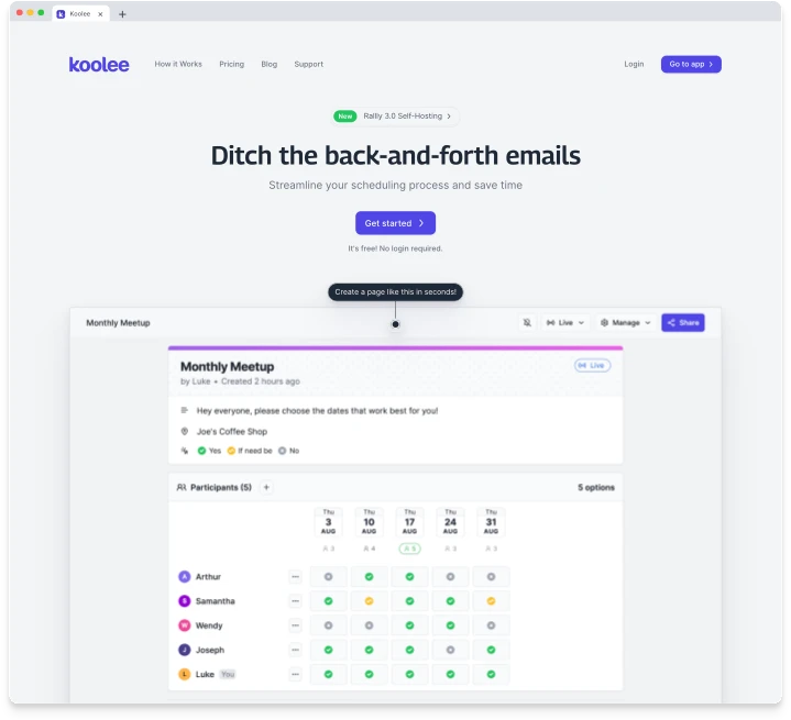
Following extensive discussions regarding the new name, we arrived at a fresh direction: Koolee, a derivative option inspired by Kooley.
Revamping Rallly’s Visual Identity
Logo Exploration
We kicked off the visual identity exploration by introducing logo concepts. Our goal was to provide Koolee with a fresh logo that would set the tone for the broader visual identity update.
The name Koolee draws inspiration from a breed of Australian cattle dog (Koolie). This choice is closely aligned with the product’s purpose, primarily geared towards facilitating the organization of group meetings. In our initial exploration phase, we leaned into this concept, emphasizing the cattle dog motif.

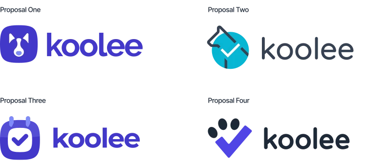

Logo Exploration: Final Proposals
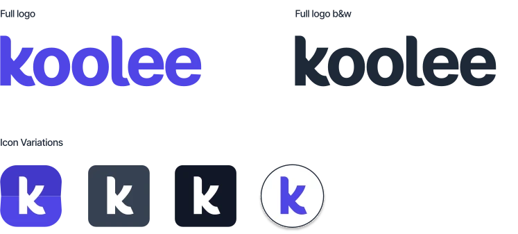
After receiving feedback on the initial designs, the stakeholder requested that we move in another direction and explore the possibility of a wordmark as a logo. We offered another round of proposals, now including wordmarks. Following minor edits based on feedback, we refined two directions from the previous proposal, resulting in the final logo for Koolee, as illustrated below.


Visual Guidelines
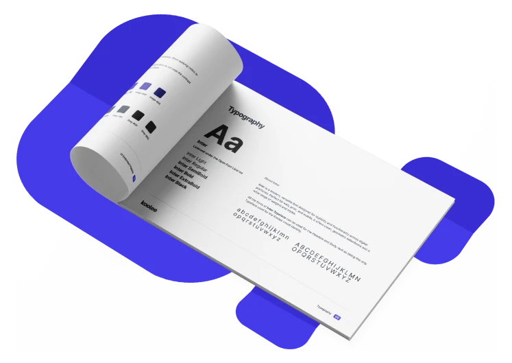
The Visual Identity Guidelines document serves as the go-to resource for all visual elements representing Koolee. It provides a documentation of the visual assets such as the correct versions of the logo, the extended color scheme and typography, ensuring consistency across various platforms, be it a website, printed materials, or promotional content.
Link: Visual Identity Guidelines
User Research
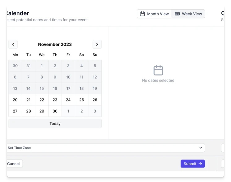
The goal of our research project was to understand how people used Rallly to make polls for their events, with a focus on finding ways to make the process better. Users choose between a monthly and a weekly view when scheduling a poll for an event. When creating polls to find a common meeting time, users considered factors such as scheduling preferences, availability, and ease of use.
To delve deeper into user experiences and preferences, we conducted user interviews as part of our methodology, aiming to gather firsthand insights and feedback to inform future design decisions.
Link: Research Report
User Testing
Our user testing aimed to understand how people used Rallly to create event polls. Rallly offers users the choice between monthly and weekly views for scheduling polls, with options for selecting narrower time slots. The main objective of performing the poll creation usability test is to measure:
- Users’ understanding of the purpose of Rallly.
- How easy it is for the users to follow the instructions to create a new poll.
- How easy it is for the users to create a poll involving time zones.
- How likely is it that the testers would use Rallly in their everyday life and recommend it to their friends and contacts?

Participant Profiles
We conducted five remote 1:1 usability tests via video calls, each lasting approximately 30 minutes. Participants performed 5 common tasks, with a few also testing additional cases beyond the original tasks.
| Person # | Event Creation | Method of Choice | Familiar with Rallly |
|---|---|---|---|
| P1 | Less than once a day | Google Workspace Google Calendar Doodle |
No |
| P2 | At least 5 times daily | Internal: Google Calendar External: Email |
No |
| P3 | At least 5 times daily | Internal: Company Calendar External: Rallly |
Yes |
| P4 | Once a day | Hubspot Calendly |
Yes |
| P5 | Once a week | When2Meet |
No |
Person 1:
- Schedules calls less than once a day
- Uses Google Workspace, Google Calendar, and Doodle for scheduling meetings
- Not familiar with Rally
Person 2:
- Schedules at least 5 times per day
- Uses Google Calendar and email for scheduling meetings
- Familiar with Rallly
Person 3:
- Schedules calls at least 5 times per day
- Uses company calender and Rallly for scheduling meetings
- Familiar with Rallly
Person 4:
- Schedules calls once per day
- Uses Hubspot and Calendly for scheduling meetings
- Familiar with Rallly
Person 5:
- Schedules calls at least once time per week
- Uses When2Meet and emai for scheduling meetings
- Familiar with Rallly
Research Questions & User Tasks
| Person # | Task | Evaluation |
|---|---|---|
| 1 | Create a poll for the 27th of November that will last a full day. | How are users interacting with the UI? |
| 2 | Create a poll for the 24th of November with 3 different time slots. | How are users going to select multiple time slots? |
| 3 | Create a poll for the 29th of November with several time slots for you (based in Berlin, CET) and your colleague (based in Cairo, EET). | How are users interacting with the event when there are time zones included as an option? |
| 4 | Create a poll for the 3 different dates and use identical time slots. | Are users understanding the function of the menu button? |
| 5 | Create a poll over different days with different time lengths for colleagues to choose from. | How are users interacting with week view? |
-
Create a poll for the 27th of November that will last a full day. How are users interacting with the UI?
-
Create a poll for the 24th of November with 3 different time slots. How are users going to select multiple time slots?
-
Create a poll for the 29th of November with several time slots for you (based in Berlin, CET) and your colleague (based in Cairo, EET). How are users interacting with the event when there are time zones included as an option?
-
Create a poll for the 3 different dates and use identical time slots. Are users understanding the function of the menu button?
-
Create a poll over different days with different time lengths for colleagues to choose from. How are users interacting with week view?
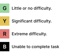
For every task, we identified if users were able to complete the task and the level of difficulty they had:

Key Findings
The purpose of Rallly was easy to understand for all participants. The participant pool was diverse with users knowing Rallly but also new users who did not know Rallly. Any future studies should feature a diverse participant pool to reduce bias.
Besides understanding the app’s purpose, the participants understood the instructions and found most steps intuitive, with a few exceptions.
- Design improvements should focus on selections and indications for time zones.
- Ensure the availability and usability of the week view are considered in the design enhancements.
- Urgently improve the usability of time slot selection and changes within the week view.
- Enhance the visibility of replicating identical time slots from the context menu.
- Keep users engaged by offering a “New Poll” option anywhere on the app to enhance the feeling of flow.
Participants found the app helpful and they could see themselves using it in the near future, including self-hosting.
UX Recommendations
While participants generally found the app intuitive, our research insights enabled us to pinpoint specific areas for design enhancement. This allowed us to offer targeted recommendations for improving the user experience.
Insight: Users did not seem to understand the contextual nature of the additional menu, and consequently they refrained from selecting available options. Having a clear menu explanation would improve users’ understanding.

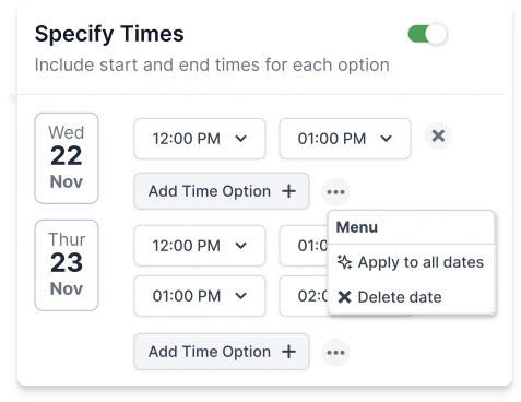
Recommendation: We recommended removing the breadcrumb and making the “apply to all dates” button visible at all times. We also suggested elevating the “delete all dates’’ button to a top-level position in line with the list of dates/times, signaling that it applied universally.
Insight: There is no clear connection between the “Specify times” toggle button and the “Ignore time zone” drop-down list. It took users quite some time to figure out the connection between these two options.

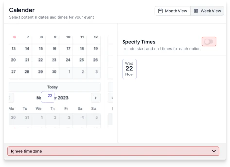
Recommendation: Ensure selecting a time zone is consistently emphasized, creating awareness for both poll creators and recipients. One effective approach is to incorporate the time zone selection within the naming and description section of meeting creation. This way, users, even those unaware of its importance, will be prompted to select it, fostering better context understanding throughout the process.
Insight: Based on our observations, users that have just finished setting up a poll and would like to continue setting up a new poll, will be looking to continue the process in a continuous flow, e.g. by clicking “New Poll”.
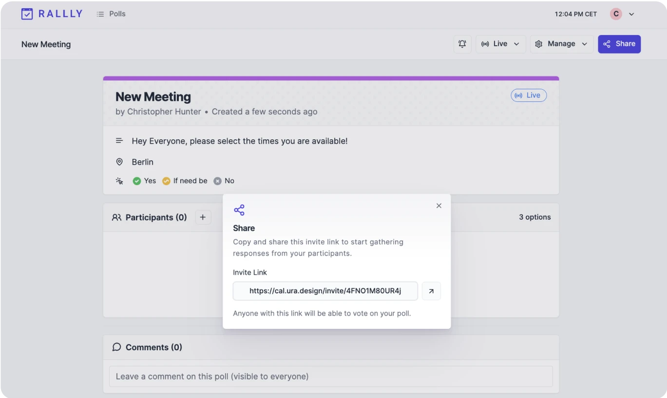
Recommendation: We recommend enhancing the visibility of the ‘new poll’ button by positioning it more prominently in the top left/right corner of the page. Maintain the current blue styling but ensure the button is always visible, allowing users easy access to this action.

How we helped
- Strategic Rebranding: Rebranded Rallly by removing the triple “l,” optimizing its name for improved discoverability.
- Enhanced Accessibility: Improved design accessibility through a revamped visual identity, emphasizing enhancements in color contrast and maintaining consistency throughout the platform.
- User Research: Conducted user research to gain insights into why and how users engage with the product.
- Offered Suggestions for Improved UX: Formulated UX strategy recommendations by distilling key insights obtained from thorough user research.