Internews SaferJourno
We designed a distinct visual narrative for Internews SaferJourno, from the visual identity inception to a dedicated web platform for journalism trainers.
Sources
Started in 2014, SaferJourno’s goal was simple: help those teaching journalists to stay safe online. With the digital world constantly changing, so have the challenges journalists face. Our updated guide addresses both old and new threats. Whether you’re a seasoned expert or just starting out in teaching digital safety, this guide is for you. It offers hands-on activities, real-world examples, and a special section to assess digital risks, making it a handy tool for every chapter.
At Ura, we’ve teamed up with Internews on several projects in the past, mainly around design. With SaferJourno, our task was to provide them with a new visual identity starting with a logo and followed by visual assets and also designing and developing their website which serves as a guide dedicated to Digital Security Resources for Trainers of Journalists.


Logo
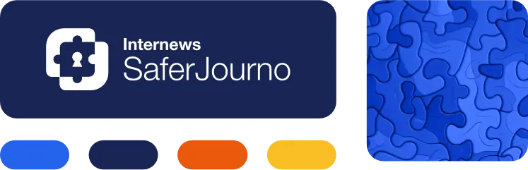
The logo of SaferJourno is inspired by two basic elements: the jigsaw puzzle and the lock. The jigsaw puzzle in SaferJourno’s logo symbolizes the multifaceted challenges journalists face in the digital realm, while the lock underscores our commitment to providing steadfast protection against these threats.
Proudly a project of Internews, an organization renowned for empowering local media worldwide to give people the news and information they need, the tools they can trust, and the means to connect their voices, SaferJourno’s logo incorporates a refreshed color system. This palette draws inspiration from the primary hues of the Internews visual identity, ensuring a seamless connection between the initiatives.
![]()
![]()
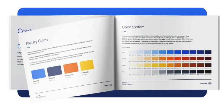
Visual Guidelines
The brand book serves as the reference for all visual representations of Internews SaferJourno. It outlines the dos and don’ts, ensuring that each depiction aligns with the set guidelines, from color patterns to fonts. By harmonizing these components, the brand book ensures that Internews SaferJourno’s identity stays uniform and unique, whether showcased on a website, in a printed piece, or through promotional content.
Link: Visual Identity Guidelines
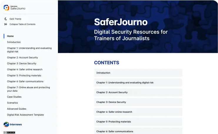
The Guide for Trainers and Journalists
SaferJourno’s Guide for Trainers and Journalists was initiated to fortify digital security for journalists’ trainers. As digital threats evolve, from basic hacks to state-backed online smears, the updated SaferJourno provides comprehensive, adaptable guidance for all trainer levels. With real-world scenarios and a specialized risk assessment, the new SaferJourno isn’t just an upgrade—it’s crucial for safeguarding journalists in today’s intricate digital landscape.
We took pride in developing their new accessible website, ensuring the guide’s mission and resources are easily reachable to all. Offering nuanced strategies for trainers of varied expertise and incorporating real-life scenarios with a specialized risk assessment, this guide is an essential shield for journalists navigating today’s intricate digital realm.
Prioritizing Accessibility
Web reports are better than PDFs for many reasons, especially when it comes to being user-friendly and accessible. Ura Design worked with Internews SaferJourno to move their guides from static PDFs to interactive web pages. This switch makes it easier for everyone, including people with disabilities, to access and understand the content. With web reports, the information can adapt to any screen and can be read by tools for the visually impaired. This means more people can use and benefit from Internews SaferJourno’s resources. Making things accessible is essential for reaching everyone effectively.
Features
-
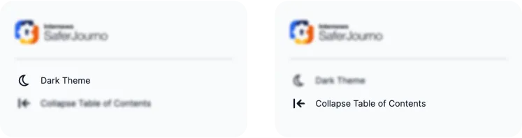
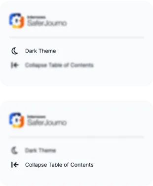
Dark Theme This option offers a visually appealing and accessible reading experience that complements the default Light mode. The theme ensures optimal readability in low-light environments and presents a sleek alternative aesthetic. Dark Theme mode maintains the same level of legibility and clarity as Light mode, ensuring an inclusive experience for all users. A single button enables switching between Light and Dark modes, empowering users to personalize their browsing experience without sacrificing accessibility or content quality.
-
Collapse Table of Contents With this feature, users can optimize their reading experience by collapsing the Table of Contents sidebar. With a single click, users can declutter their screen, maximize available space for content, and enhance reading focus. When needed, the sidebar expands again with a click to provide quick access to the Table of Contents.
How We Helped
- Visual Identity: Created a fresh look for SaferJourno with a symbolic logo that connects with Internews colors.
- Brand Consistency: Developed a brand book to keep SaferJourno’s look consistent across all platforms.
- Website Design: Built an accessible website for their Guide, ensuring resources are easy to find and use.
- From PDFs to Web: Transformed static guides into dynamic web pages, making content more accessible.
- User-Friendly Features: Added a Dark Theme for better readability and a collapsible Table of Contents for focused reading.